La Luz Jewelry
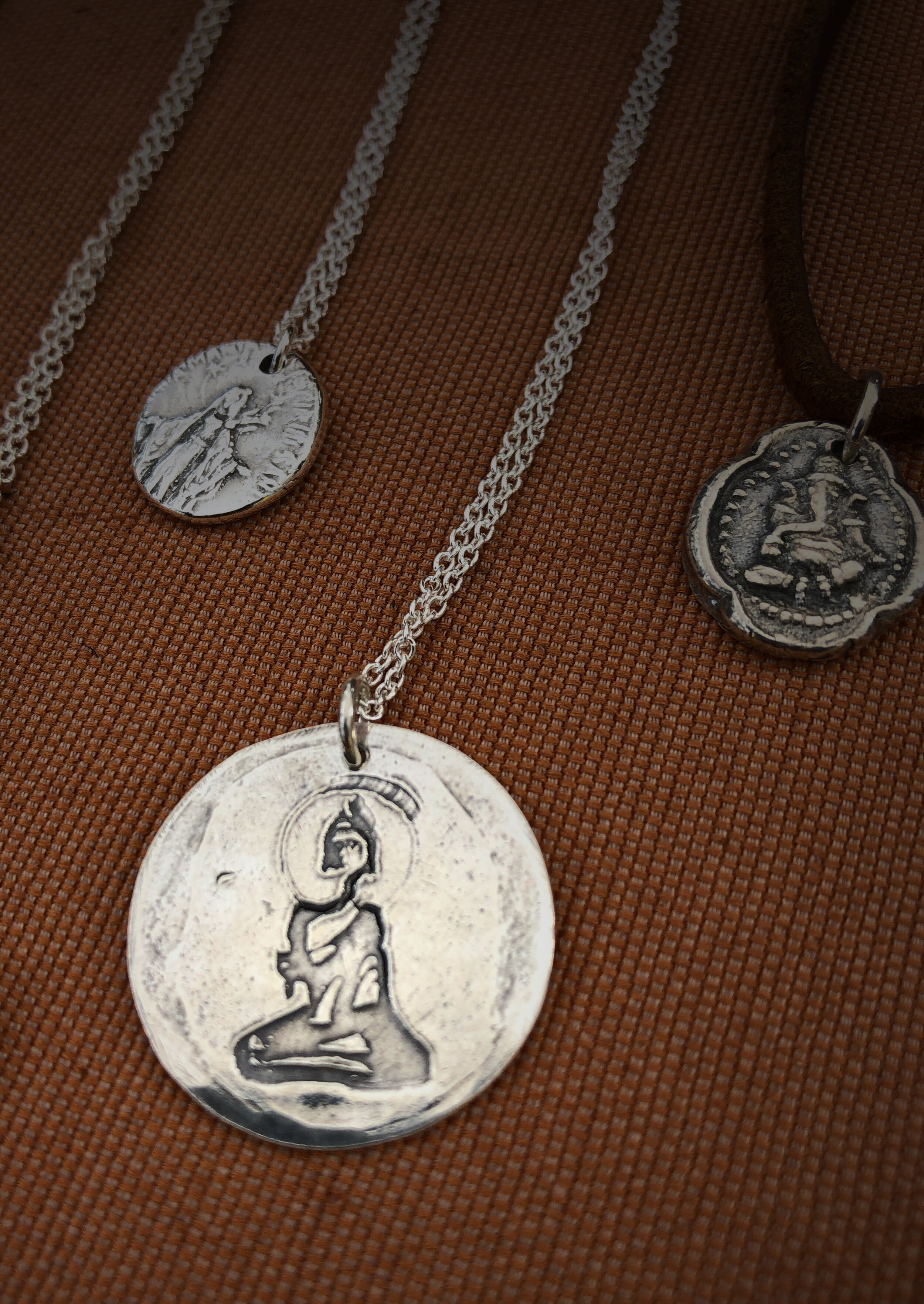
La Luz is a Jewelry business ran by Rhonda McCarty in San Diego, California. She creates all the pieces by hand, crafting metal and leather into unique necklaces, bracelets, rings, and more.

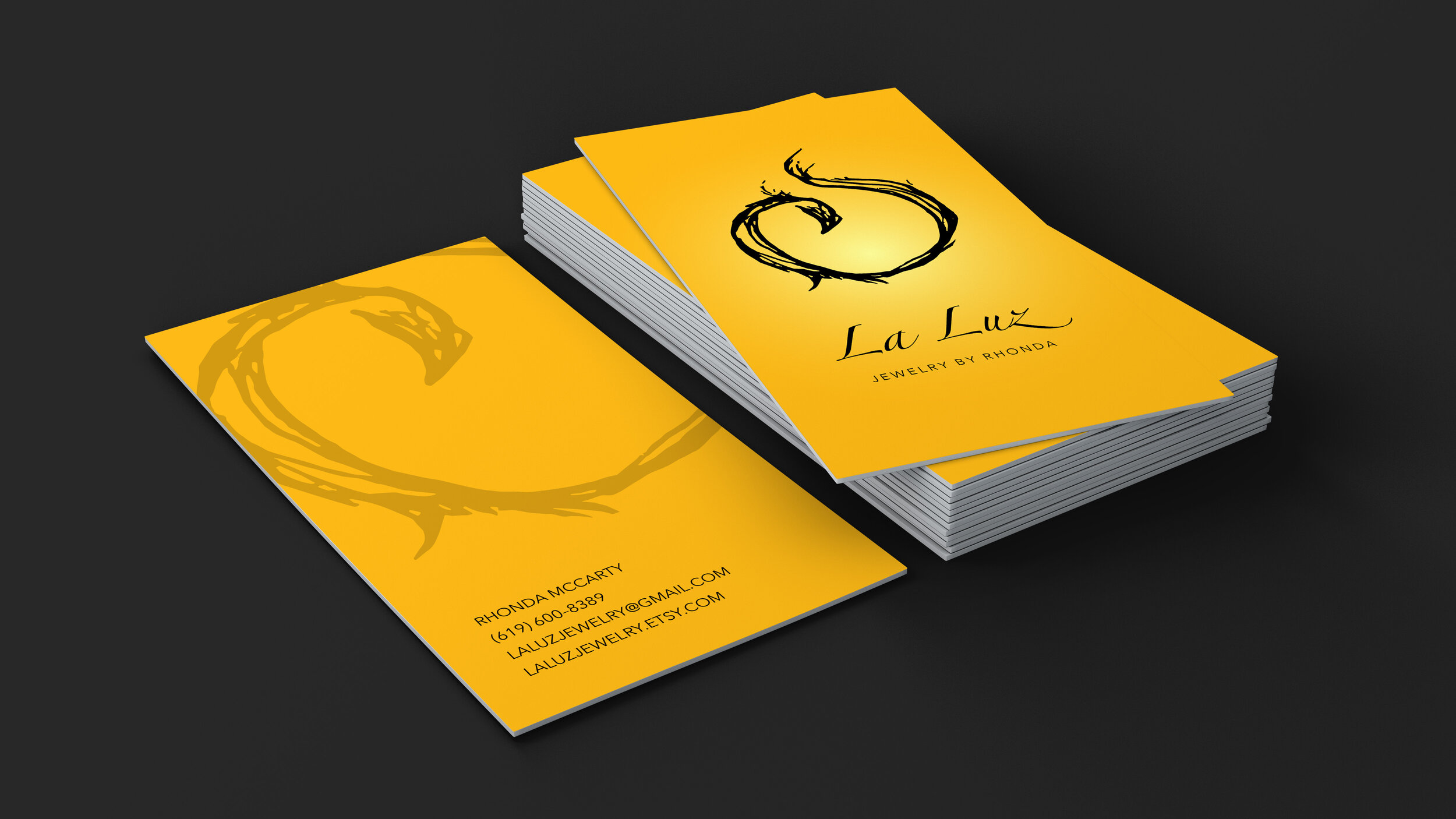
Rhonda asked me to create a logo for her business—a phoenix, to represent light and rebirth. Since her Jewelry is all crafted by hand, she wanted her logo to have a natural hand-drawn feel as well.

Rhonda envisioned a simple image, a symbol that could be interpreted in a variety of ways.
The flowing lines of the logo reflect the natural, organic feel of the brand. This phoenix can resemble a flame, a ring, or an elegant abstract mark.

To complete the logo, I used Zapfino, a simple and elegant calligraphy font, paired with Avenir, a popular sans-serif. Both are easily legible and have enough refinement without becoming pretentious.

Lastly, a golden yellow with a gradient was added to further emphasize the light and rebirth elements.
La Luz means “The Light” in Spanish, just in case your español is muy poquito 😉


I created a few more designs for La Luz, staying with the organic style. The icons include a Hamsa, a Buddha, and some animals like a snake and a dove.


